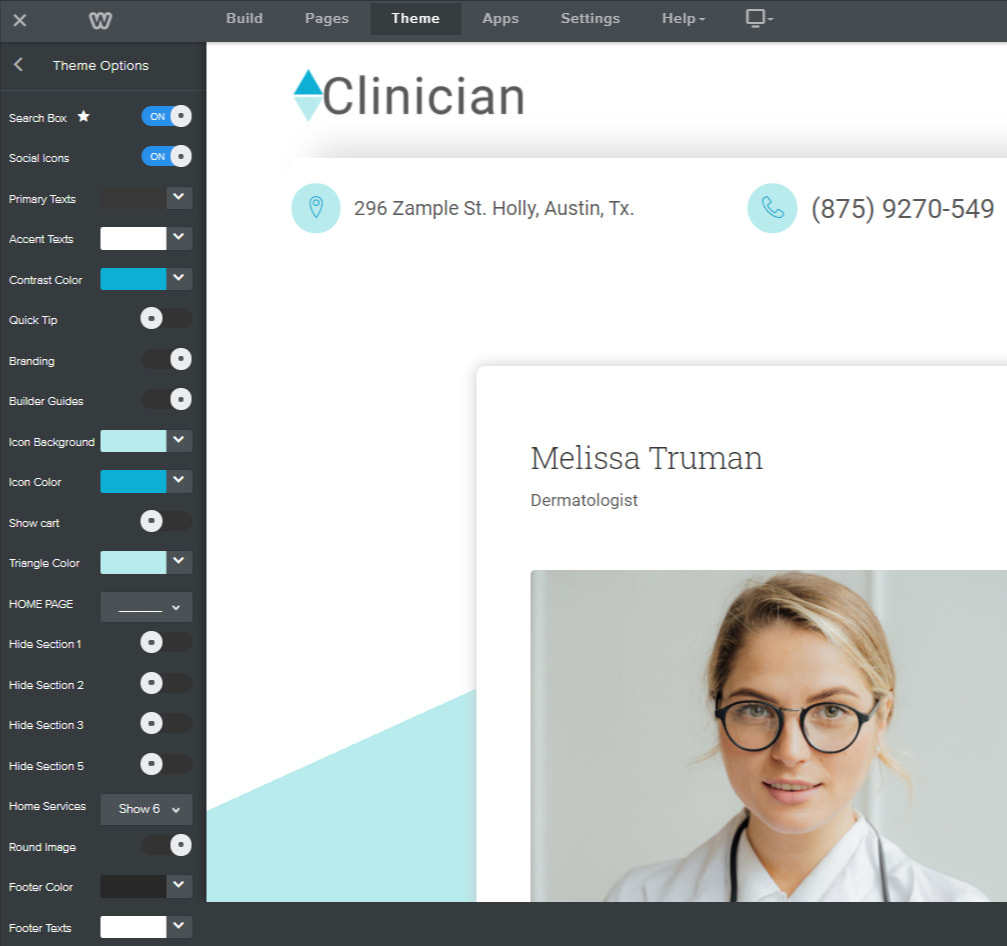
Primary Texts:
Sets the texts color that appears on sections with Primary Background color. If the Primary Background Color is dark, the Primary Texts should be set to white or any other lightter color for visibility.
Accent Texts:
Sets the texts color that appears on sections with Accent Background color. If the Accent Background Color is dark, then Accent Texts should be set to white or any other lightter color for visibility.
Texts Color:
Sets the text color of the paragraph "Text" element. Use this color option instead of weebly default option for styling the text element.
Contrast Color:
Sets link color and links hover color. Contrast color should always be set to a dark color such as blue, red, orange, etc. for visibility.
Quick Tip:
Add/Removes the welcome screen with the message on how to get started.
Branding:
Add/Remove the "Powered by Roomy Themes" branding in the footer.
Builder Guides:
Add/Remove guides from the website editor. The "Builder Guides" helps identify content sections such as where to edit and where to drop elements.
Icon Background:
Sets the background color of the small circles in the header that contain icons for address, phone, and appointment.
Icon Color:
Sets color of icons within the small circles in the header
Triangle Color:
Sets the color of the triangular shape behind content box area.
Sets the background color of the small circles in the header that contain icons for address, phone, and appointment.
Icon Color:
Sets color of icons within the small circles in the header
Triangle Color:
Sets the color of the triangular shape behind content box area.
Home Page
Hide sections 1, 2, 3, and 5.
Removes above listed custom content sections within the homepage
Home Services:
Select number of service boxes to show on the homepage to 3, 6 or 9.
Hide sections 1, 2, 3, and 5.
Removes above listed custom content sections within the homepage
Home Services:
Select number of service boxes to show on the homepage to 3, 6 or 9.
Round Image:
Make image corners rounded or straight.
Make image corners rounded or straight.
Footer Color:
Sets the background color of the footer bar.
Footer Texts:
Sets the color of footer texts.
Sets the background color of the footer bar.
Footer Texts:
Sets the color of footer texts.
